Website · Baku
Yakitori: restaurant website
A menu website for an Asian restaurant: plain HTML, CSS and JavaScript with no CMS and no build step, two language versions as separate pages, menu sections rendered from data, sticky navigation and a lightbox.
01About the client
Yakitori · Asian Food is an Asian restaurant in Baku, on the fourth floor of Sevinc Mall: sushi and rolls, soups, noodles, fried rice, udon, tempura, salads, waffles, ice cream and drinks, plus delivery across the city. A guest comes to a site like this for one thing: to read the menu with prices and call. That means the site has to open instantly on a phone and show a dish as a photograph, not as a line in a list.
02What we did
- Built the site in plain HTML, CSS and JavaScript: no CMS, no bundler, not a single external dependency. Pages are served as finished files, an update is a folder copy, and there are no plugins to break on the next release.
- Separated data from rendering. The entire menu lives in one data file, and a script builds both the card grid and the section navigation from it. Changing a price or an ingredient list never touches the markup.
- Shipped the two language versions as separate pages rather than a client-side switcher: Russian on yakitori.az, Azerbaijani on yakitori.az/az. Each has its own canonical and a full hreflang cluster - ru, az and x-default. A search engine sees two self-contained documents, not one document swapping its text.
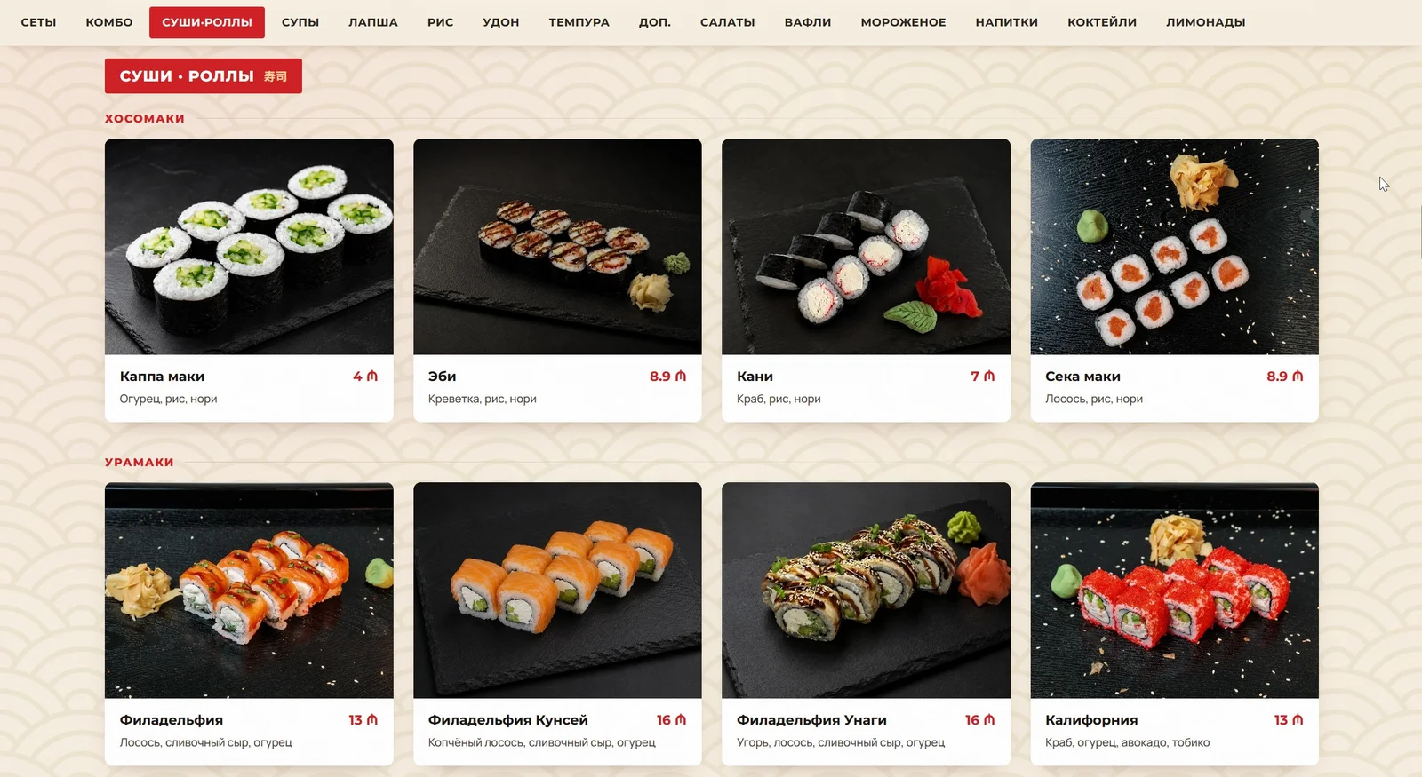
- Laid the menu out across 15 sections - from sets and combos to lemonades - with five groups inside sushi and rolls: hosomaki, uramaki, hot rolls, baked rolls, and the sushi burger with rice balls. The last three sections are typeset as a price list and fold into columns automatically.
- Built sticky section navigation: the active item is highlighted by an intersection observer, the strip scrolls with the wheel and drags with the mouse, and a click right after a drag is suppressed - otherwise dragging would randomly jump to another section.
- Added a lightbox: clicking any photo opens it full screen, and it closes on any click or the Escape key.
- Cropped the dish photography in CSS only, without touching the files. For the soups, the scale and focal point are tuned so the bowls come out the same size across a row; the lightbox still opens the untouched original, because it lives outside the cropping container.
- Wrote the full search markup: title, description, canonical, hreflang, geo metadata, Open Graph and a Twitter card, and JSON-LD Restaurant with the phone, address, opening hours, coordinates and price range.
- Converted every raster image to WebP and deployed to Cloudflare Pages; the www address redirects to the main one, which keeps the QR code on the printed flyer working - the www form is what went to press.
03Design and structure
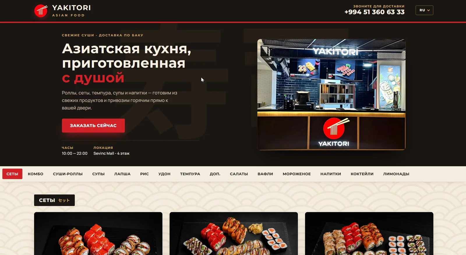
The site runs on the brand’s two themes. The dark one covers the header, the first screen and the footer: dark brown ground, cream text, gold lettering and a red rule under the header. The light one carries the menu itself: cream paper with a seigaiha pattern, white dish cards, red prices. The result reads as a printed menu card laid on a dark cover, which is exactly what the restaurant is. The first screen is not an advert: a headline, one sentence, an order button and two lines of facts - opening hours and the address. The phone number sits in the header and again in the footer, because orders here come by call, not through a cart.
04Typography and the Azerbaijani version
Three typefaces, and there is no fourth on the site: Montserrat for headings, dish names and prices, Manrope for ingredient lists and descriptions, Noto Sans JP for the Japanese section labels. The split is not decorative. Manrope physically lacks the manat sign and the Azerbaijani letter Ə, so every price is set in Montserrat, and Manrope is backed up by that same Montserrat: it is what draws the Ə inside Azerbaijani dish descriptions. Without it the browser would silently fall back to a system font: CSS gives no sign of this, the family is assigned and everything "works", yet the letter drops out of the line. We checked it with a script rather than by eye: it asks the browser which real font rendered each text node on both pages.
The second Azerbaijani trap is casing. A plain uppercase transform turns i into I, while Azerbaijani needs İ, so every string that renders in caps is already stored capitalised in the data and the transform stays a no-op.
05How the site behaves on a phone
Most orders come in from a phone, so the menu grid was checked not on one screen but across fourteen widths, from a wide monitor down to a narrow handset. One rule sits behind all of them: a dish name must never break onto a second line and collide with its price. To hold it, the grid is forced into two columns on a tablet, the price drops below the name on a phone instead of sharing a line with it, and on the narrowest screens the whole text steps down a size. Sizes were tuned to Montserrat: at the same setting it runs about a fifth wider than Manrope, so eyeballing them does not work here.
06Timeline and process
About a week of work. The site went live at yakitori.az on 17 August 2026, and the project closed on 18 August, together with the flyer: the flyer carries a QR code pointing to the site, so the two could not be signed off separately.
Tech stack