Design · Baku
Yakitori: menu design
A printed A4 menu book across 10 sheets: 68 items with photography, two language versions built from one layout, an editable PPTX for the client and a print PDF with the type converted to outlines.
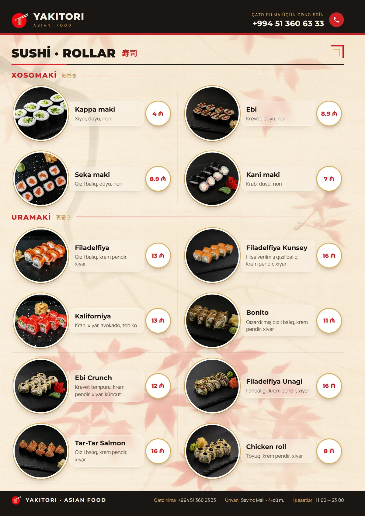
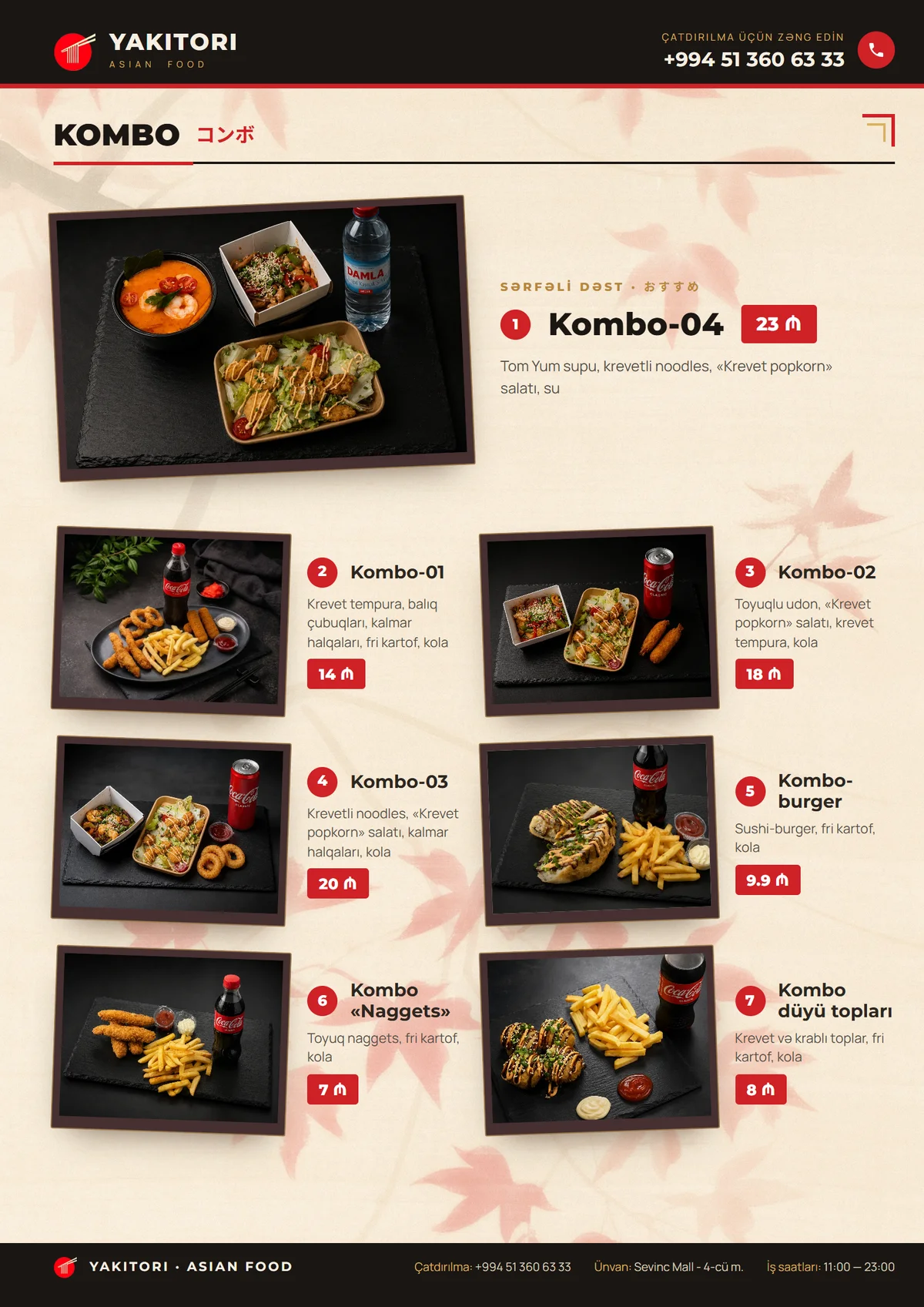
01About the client
Yakitori · Asian Food is an Asian restaurant in Baku, on the fourth floor of Sevinc Mall. A printed menu on the table is not just a list: the guest holds it for several minutes and chooses by the photograph. What was needed was a book covering the full range, in two languages at once, delivered so that the restaurant could edit the text itself and the printer could go to press without touch-ups.
02What we did
- Laid out an A4 menu book across 10 sheets: five physical sheets, double-sided, spiral bound. It carries 68 items, each with its own photograph - 77 shots in total, with no empty slots.
- Built both language sets, Russian and Azerbaijani, from one layout. The Azerbaijani book is not a fork: the markup, the styles and the converter are shared, and only the text file is separate. Three safety checks fail the build if the source structure drifts, if a service key appears a different number of times than declared, or if visible Russian text is left on a finished page.
- Delivered an editable PowerPoint rather than flat images: the restaurant changes a price or a name itself, without coming back to us.
- Generated the deck from measurements of the rendered page rather than from constants. Box coordinates, text with line breaks already resolved and image paths are read off the drawn layout, so a layout edit travels into the PPTX by itself, with no manual re-typing.
- Cropped the photography with a parameter in the data instead of in an image editor: one formula becomes CSS for the layout and a source rectangle for PowerPoint, so the crop matches in both and the original files stay untouched.
- Produced three print variants for different binding options - spiral, no spiral, and a 12-page version - generated by script from a single source, with no duplicated project files.
03Design and structure
The cover is dark and the inner sheets are light: cream paper with a momiji leaf background, dark ink, red accents and gold hairlines. The header and footer of every sheet stay dark, so the book reads as one object rather than a set of unrelated pages. Each spread has its own card archetype matched to the type of dish: a tile with the photo on top for the sets, a round photo in a white frame with a gold ring for rolls and soups, a large card with the photo on the left for hot rolls, a tilted polaroid for the combos, and a typographic price list for the drinks. The last sheet closes with a round hanko seal reading "Enjoy your meal".
Some decisions came from the client mid-project, and they changed the layout noticeably. White panels behind the cards took up around 70 percent of a sheet and completely hid the leaf background - they were rejected. A card is now translucent glass with a gold hairline, the background shows through it, and the price sits as a tag in the top right corner. The decorative kumiko corners went for the same reason: the sheet became calmer.
One more rule came out of the layout itself: row heights are never hand-tuned, the sections stretch on their own and fill the sheet down to the footer. The worst remaining slack after the spiral margins is under a centimetre, on the sets sheet: the page is filled practically to the edge.
04Print
- Mirrored margins for the spiral: 12.2 mm on the binding side and 6.6 mm on the outer one. The front of a sheet keeps the spiral on the left, the back on the right.
- The logo and phone numbers were pushed down from the top edge: 2.9 mm before, 6.3-6.6 mm now. The original figure was inside the trim tolerance and the printer asked for more room.
- Type delivered as outlines: the finished PDF embeds zero fonts, the whole setting is converted to curves. We verified it with a number, not by eye - "the text can be selected with the mouse" proves nothing here, since a lookup table is written alongside the outlines purely for search and copying.
- A gradient with transparency over a photograph does not survive press: the darkening on the cover hero came back from the printer flooded magenta. We baked the darkening into the image itself and the problem disappeared.
- The PDF is assembled by our own script rather than saved out of PowerPoint: PowerPoint writes real text with embedded fonts and recompresses the images - the background arrived at roughly 110 dpi against a 300 dpi requirement.
05Timeline and process
Five days of work. The menu was approved, produced and printed, and the work closed on 10 August 2026. The final package: six print PDFs covering three binding options, plus two editable PPTX files in Russian and Azerbaijani.
Tech stack