Branding · Baku
Yakitori: brand design
A restaurant identity built from scratch: two themes, three typefaces with verified glyph coverage, a set of graphic devices, and a technical brand reference that lets the identity be reproduced exactly.
01About the client
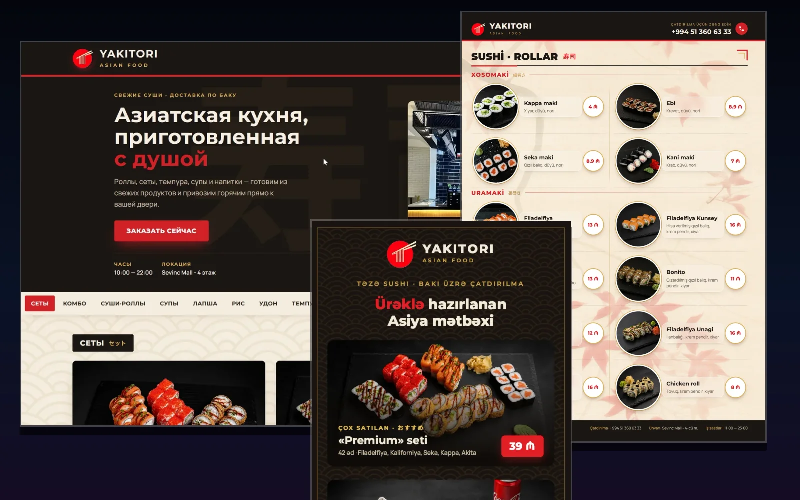
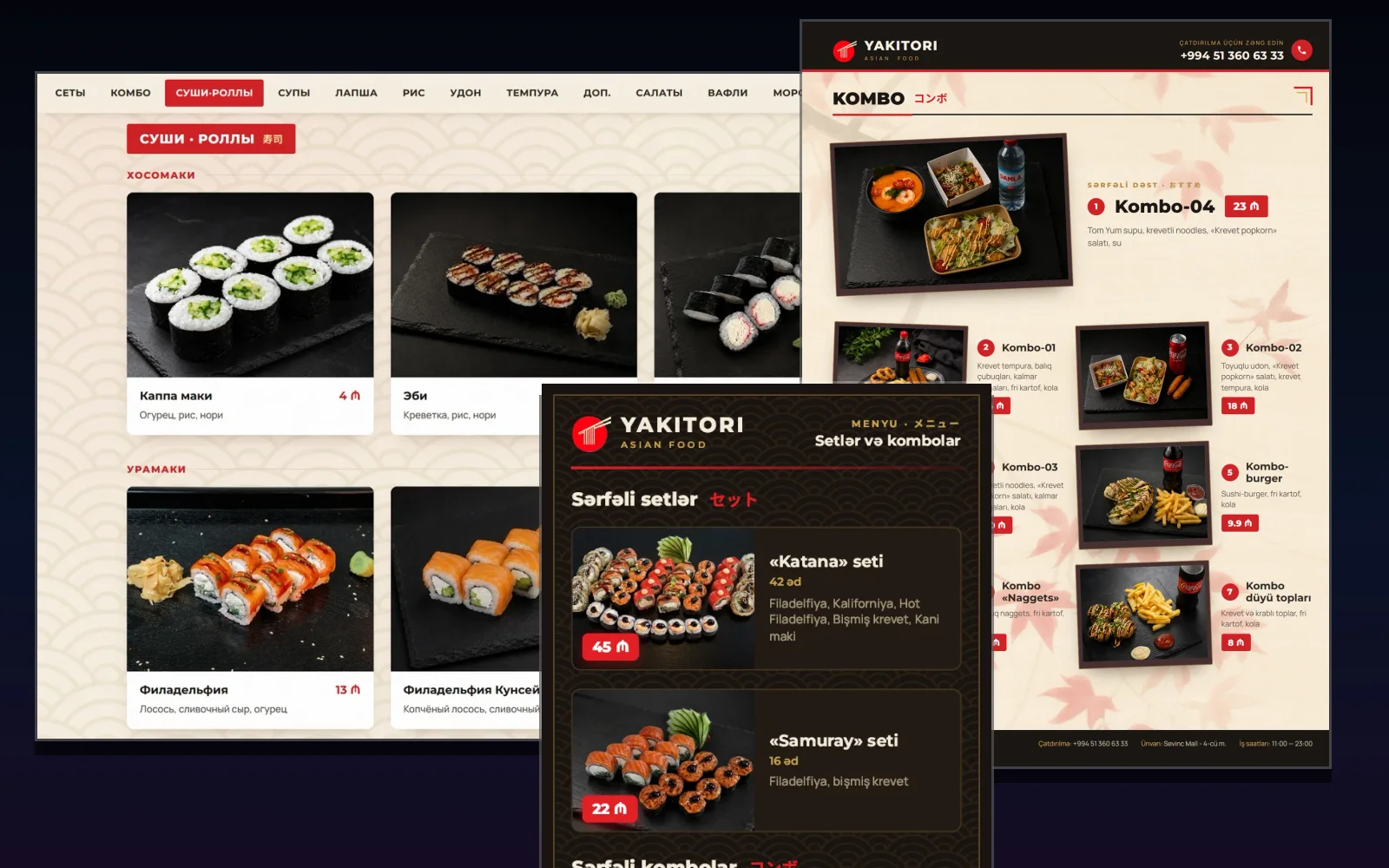
Yakitori · Asian Food is an Asian restaurant in Baku, on the fourth floor of Sevinc Mall. When we picked up the project, the company had a name and a logo. Nothing else existed - no palette, no typography, no graphic language, no layout rules, no single set of contact details. What had to follow was a website, a printed menu and a flyer, which means three different technologies of screen and press. Without a shared system they would have drifted apart by the second product.
02What we did
- Built a palette of two themes. The light "paper" one - cream ground, dark ink, a red accent and gold hairlines: the website and the inner sheets of the menu. The dark "night" one - dark brown ground, cream text, gold and red on top: the whole flyer, the menu cover, the header and footer of every menu sheet, and the header and first screen of the site. The split is deliberate: the light theme is a menu card, the dark one is its cover.
- Set the typography on three typefaces and fixed a role for each: Montserrat carries everything "interface" - headings, item names, prices, labels, the phone number; Manrope carries running lowercase text - ingredient lists and descriptions; Noto Sans JP is used only for the Japanese inserts. The system rule: caps are always Montserrat with letterspacing, Manrope is lowercase only - its capitals are narrow and tall, and set tight they run into each other.
- Checked glyph coverage against the font files themselves rather than the documentation, and found four gaps. Two of them are critical: the Azerbaijani letter Ə and the manat sign are physically absent from Manrope. Hence two brand rules that hold across all three products: prices are set in Montserrat only, and Manrope carries Montserrat at a matching weight as the second font in the chain - that is what draws the Ə. A telephone symbol exists in none of the three faces, so the handset in the menu is drawn as a vector outline rather than typed as a character.
- Fixed the Azerbaijani casing rule: a plain uppercase transform produces i instead of İ, so every string that renders in caps is already stored capitalised in the source. This applies to the website and to both print layouts.
- Documented the graphic language: the emblem, the black bar with a red rule and gold lettering, the seigaiha pattern, the momiji leaf background, the gold frame around the perimeter, the kanji watermark, the red price badge with the manat sign, the coin price, the round photo in a white frame with a gold hairline, the tilted polaroid, the round hanko seal, the corner ornament beside every heading, the paper grain and the dotted leader in a price row. For each device it is written down which product uses it and by which values it is defined.
- Consolidated the contact details into a single reference: phone, address in two languages, opening hours and coordinates. Before that the values lived independently in three layouts and had already drifted - the website, for one, carried two different geographic points.
- Wrote a technical brand file: not a mood-led brand book but a reference with exact values, paths and commands - which weight sets each element, which colours belong to each theme, where the fonts live, what checks a layout, and which traps have already been hit. It lets the identity be reproduced exactly rather than by eye, including by a contractor who has never seen the project.
03How it works in practice
A system proves itself by the decisions it produces, not by how neatly it is described. One example: the rule for item copy - three ingredients or more are listed with commas, fewer than three are replaced by a short description. It works identically in a 68-item menu and in a six-item flyer, so dish names read the same across media even though they were laid out at different times in different files.
A second example is verifiability. Typography cannot be accepted on looks: the family is assigned, everything "works", and yet one glyph is missing from it, so the browser silently draws that character in a system font - a different one on every machine, and in a print PDF a foreign embedded fragment. So the system carries not only rules but a way to check them: a script asks the browser which real font rendered each text node, and catches the substitution before the layout goes to press.
04What was the client’s already
The logo and the name existed before us and we did not touch them - the system was built around them. Everything else - the two themes, the typography with its rules and constraints, the graphic language, the font file set, the unified contact details and the technical reference - was produced within the project and handed to the client along with the layouts.
05Timeline and process
The identity work ran from 10 to 18 August 2026. The system took shape alongside the products: whatever surfaced in one of them immediately became a rule for the other two. By 18 August it was consolidated and written down in the brand reference in full.
Tech stack